It’s About Dang Time: Visualizing Time Series Data
R
Data Viz
Time Series
Author
Lydia Gibson
Published
May 28, 2023
In this blog post, which will be my first to include R code, I’d like to share some of the time series visualizations I’ve seen as I’ve been reading Data Visualization with R by Rob Kabacoff.
“TIME is not a line, but a SERIES of now-points.” -Taisen Deshimaru
When I first told my Data Visualization Society (DVS) data viz mentor, Ilija Stojić, and others that I would be naming my blog Once Upon a Time Series, naturally their first instinct was to ask whether my blog would be about time series analysis. To that I answered with a resounding no. Although, I had been fostering a general love of data visualization several months prior to creating my blog, I was just a sucker for a pun and hadn’t yet gained experience dealing with or visualizing time series data.
In this blog post, I’d like to share some of the time series visualizations in the Data Visualization with R book, which I am currently reading as a member and co-facilitator of the #book_club-datavisr book club within the R for Data Science (R4DS) Online Learning Community. To find out more about what the book club has been up to, you can check out the notes about the book we’re creating as we read the book, the GitHub repo for these notes, and the YouTube playlist containing our weekly discussions of each chapters’ notes. Whatever way you prefer, I highly encourage you to get involved.
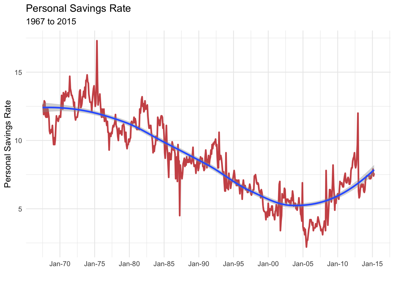
The following plot can be found in section 7.1 Time-dependent graphs: Time series of the book. It uses the economics dataset of US monthly economic data collected from January 1967 thru January 2015 and the geom_line function which come with the ggplot2 package to plot personal savings rate (psavert).
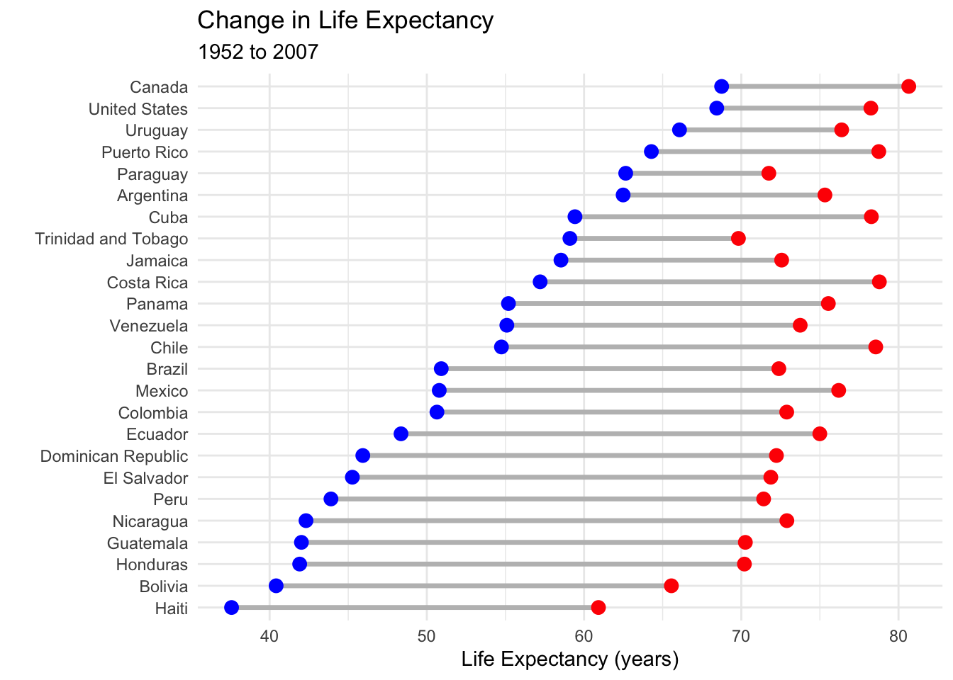
The following plot can be found in section 7.2 Time-dependent graphs: Dumbbell Charts of the book. Here, the geom_dumbbell function from the ggalt package is used, along with the gapminderdataset, to plot the change in life expectancy from 1952 to 2007 in the Americas.
library(ggplot2)library(ggalt)library(tidyr)library(dplyr)# load datadata(gapminder, package ="gapminder")# subset dataplotdata_long <-filter(gapminder, continent =="Americas"& year %in%c(1952, 2007)) %>%select(country, year, lifeExp)# convert data to wide formatplotdata_wide <-spread(plotdata_long, year, lifeExp)names(plotdata_wide) <-c("country", "y1952", "y2007")# create dumbbell plotggplot(plotdata_wide, aes(y =reorder(country, y1952),x = y1952,xend = y2007)) +geom_dumbbell(size =1.2,size_x =3, size_xend =3,colour ="grey", colour_x ="blue", colour_xend ="red") +theme_minimal() +labs(title ="Change in Life Expectancy",subtitle ="1952 to 2007",x ="Life Expectancy (years)",y ="")
Slope graph
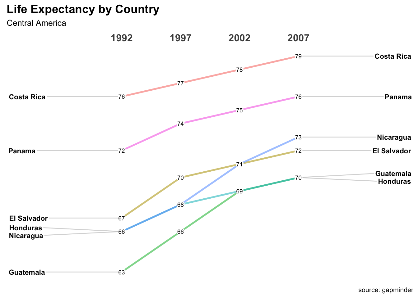
The following plot can be found in section 7.3 Time-dependent graphs: Slope graphs of the book. It uses the the newggslopegraph function from the CGPfunctions package and the gapminder data to plot life expectancy for six Central American countries in 1992, 1997, 2002, and 2007.
library(CGPfunctions)# Select Central American countries data # for 1992, 1997, 2002, and 2007df <- gapminder %>%filter(year %in%c(1992, 1997, 2002, 2007) & country %in%c("Panama", "Costa Rica", "Nicaragua", "Honduras", "El Salvador", "Guatemala","Belize")) %>%mutate(year =factor(year),lifeExp =round(lifeExp)) # create slope graphnewggslopegraph(df, year, lifeExp, country) +labs(title="Life Expectancy by Country", subtitle="Central America", caption="source: gapminder")
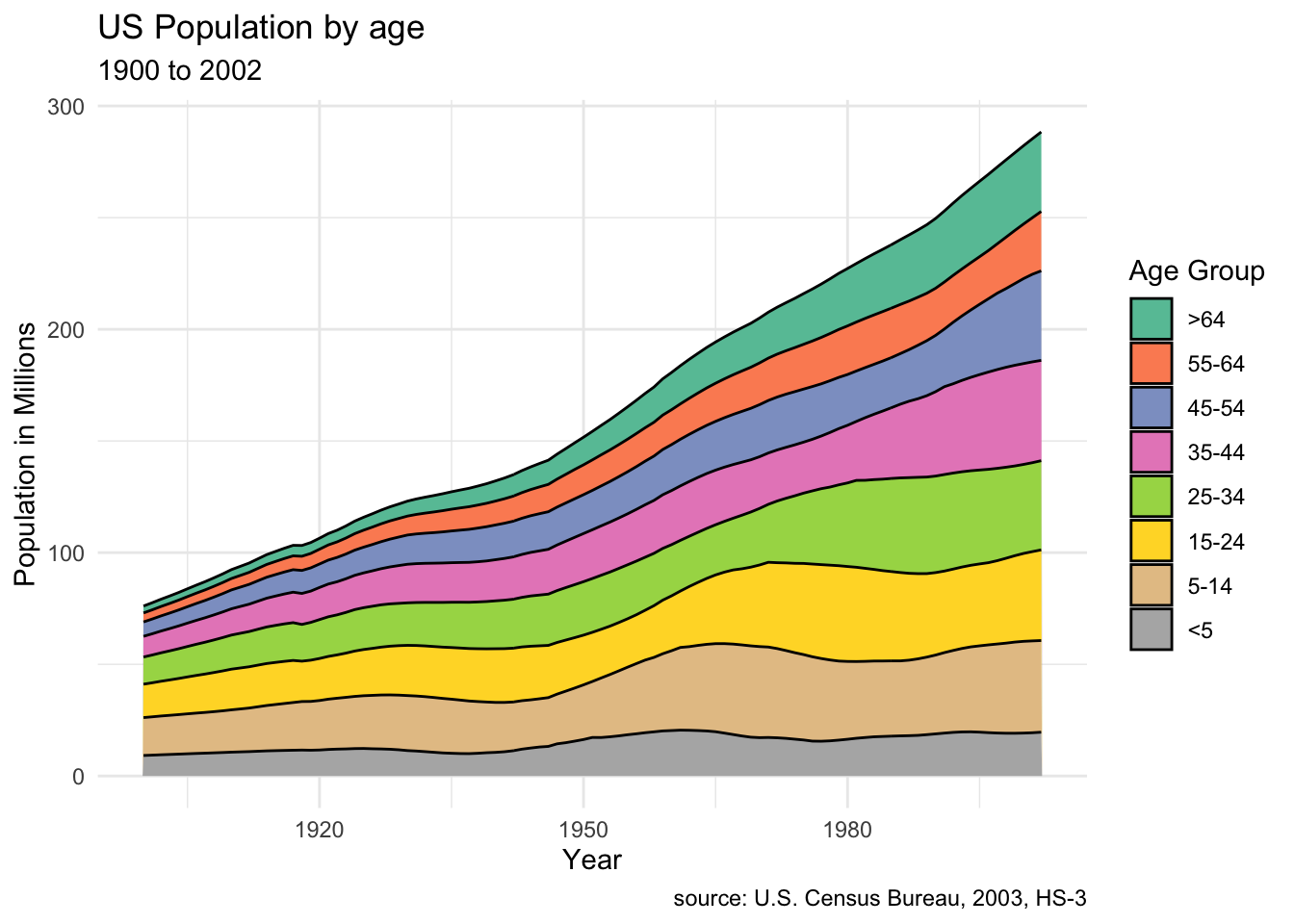
The following plot can be found in section 7.4 Time-dependent graphs: Area Charts of the book. It uses the ggplot2 package geom_area function and the uspopage dataset from the gcookbook package to plot the age distribution of the US population from 1900 and 2002.
library(gcookbook)# stacked area chartdata(uspopage, package ="gcookbook")ggplot(uspopage, aes(x = Year,y = Thousands/1000, fill = forcats::fct_rev(AgeGroup))) +geom_area(color ="black") +labs(title ="US Population by age",subtitle ="1900 to 2002",caption ="source: U.S. Census Bureau, 2003, HS-3",x ="Year",y ="Population in Millions",fill ="Age Group") +scale_fill_brewer(palette ="Set2") +theme_minimal()
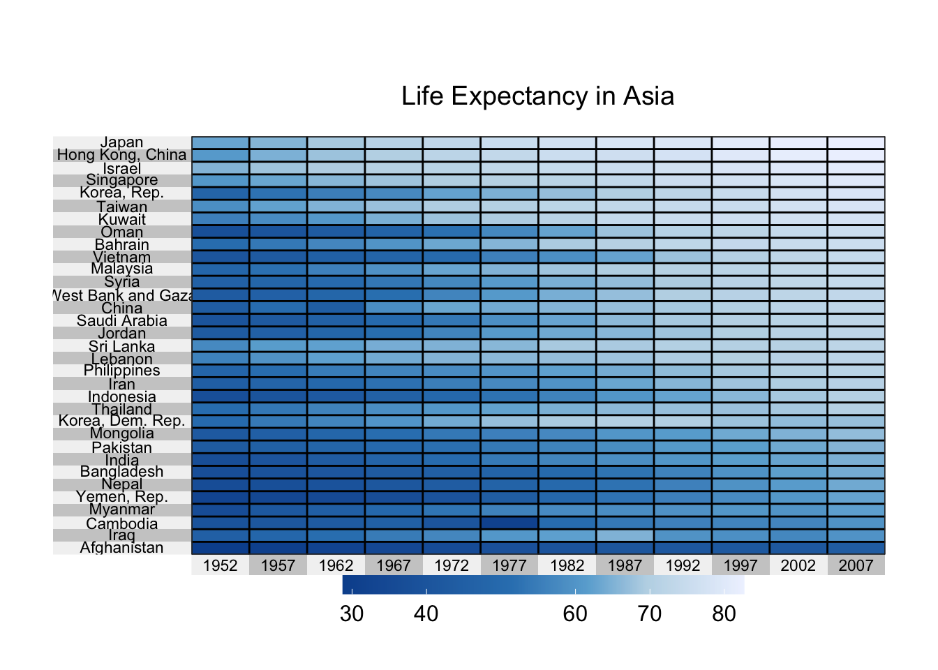
The following plot can be found in section 9.9 Other Graphs: Heatmaps of the book. It uses the superheat function from the superheat package and the gapminder dataset to display changes in life expectancy over time for Asian countries.
# create heatmap for gapminder data (Asia)library(tidyr)library(dplyr)library(superheat)# load datadata(gapminder, package="gapminder")# subset Asian countriesasia <- gapminder %>%filter(continent =="Asia") %>%select(year, country, lifeExp)# convert to long to wide formatplotdata <-spread(asia, year, lifeExp)# save country as row namesplotdata <-as.data.frame(plotdata)row.names(plotdata) <- plotdata$countryplotdata$country <-NULL# row ordersort.order <-order(plotdata$"2007")# color schemelibrary(RColorBrewer)colors <-rev(brewer.pal(5, "Blues"))# create the heat mapsuperheat(plotdata,scale =FALSE,left.label.text.size=3,bottom.label.text.size=3,bottom.label.size = .05,heat.pal = colors,order.rows = sort.order,title ="Life Expectancy in Asia")
Closing Words
I’m really excited to finish up reading Data Visualization with R and continue my exploration of the art and science of data visualization. I hope to continue chronicling this journey in a series of blog posts I intend to call “What R you doing?” . Stay tuned!
Resources
Below are some FREE online books to help you learn more about visualizing time series data and/or data in general.